It is very difficult to imagine a modern web product design without a form. The form can be found on almost any website. Below, we'll look at common rules and taboos when designing forms. Do not forget that the rules collected in this guide are general. There may be exceptions to each of the rules.
Don't make many columns:
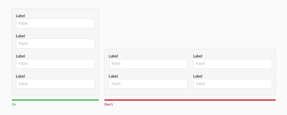
Several columns can break the vertical rhythm.
Label location for fields on top:
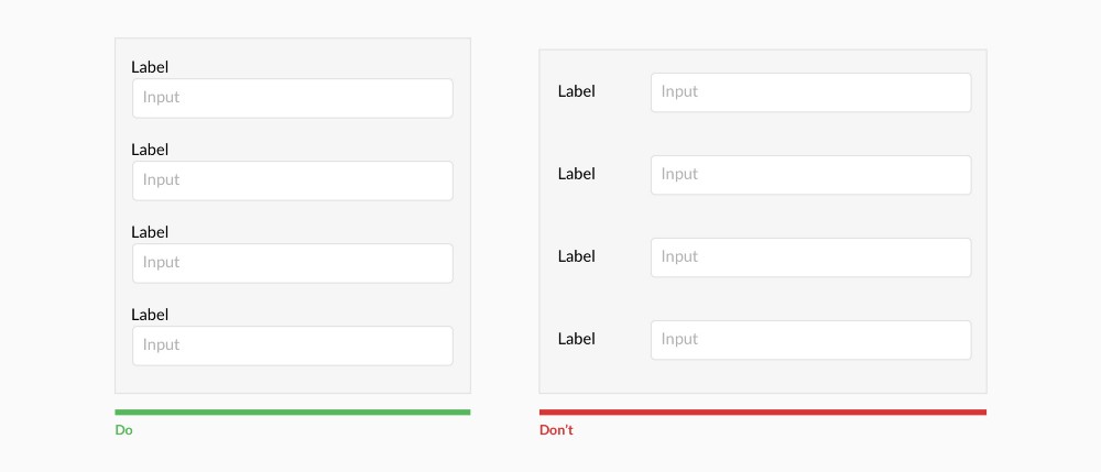
Users fill out forms with signatures on the top much faster than when they are placed on the left. Labels displayed above fields are more responsive. However, the left position is worth using when designing for forms with a lot of information and a variety of options. This will reduce the height of the form itself and improve readability.
Group fields and labels:
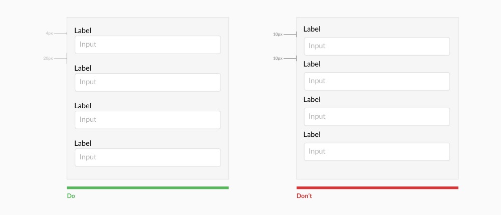
Place the label and input close to each other. Make sure there is enough space between the fields so that the user does not get confused. Users must clearly understand which label belongs to which field. This can be achieved by proper indentation between labels and fields.
Do not use capital letters:
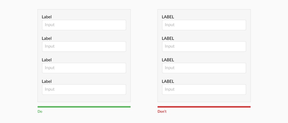
Text written in capital letters is harder to read and understand.
Show all choices if there are less than 6:
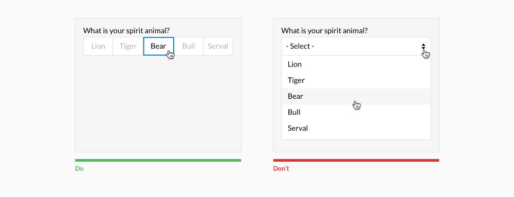
In order to select options from the drop-down list, you need to perform at least 2 mouse clicks. In addition, until the user expands the entire list, he will not see all the available options. Use it only if you have more than 5 options. If you have more than 25 options, don't forget the hints inside the menu.
Place checkboxes and radiobuttons one below the other:
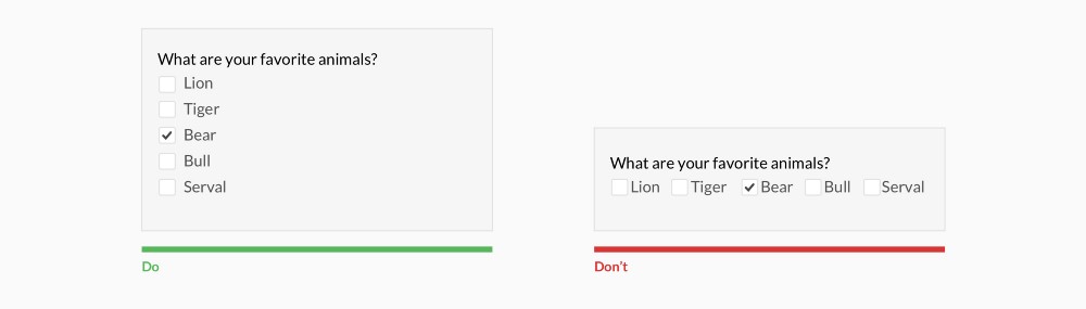
This arrangement enhances readability.
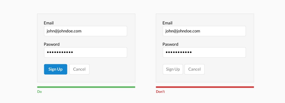
Make Call-To-Action clear:
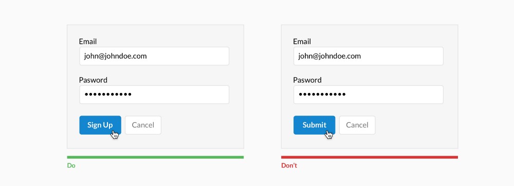
The purpose of pressing the button should be as clear as possible. Also, users must clearly understand what will happen after clicking on the button.
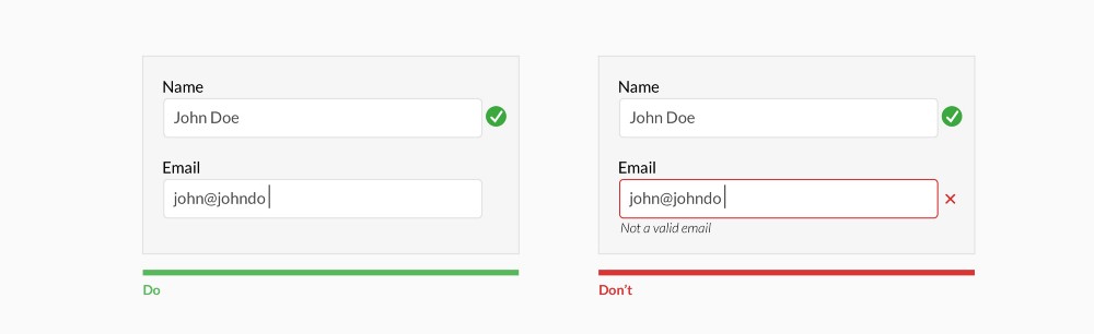
Use data validation after the user has filled in the field:
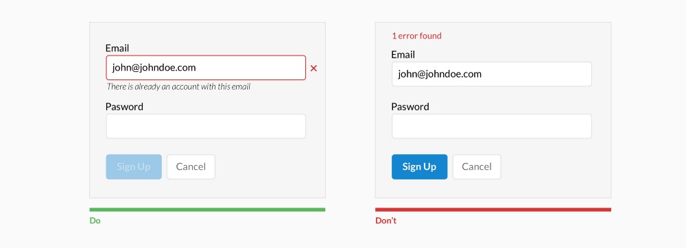
Do not use validation while the user is typing. Only if it doesn't make the process easier. As in the case of creating a password, username or message.
It's allowed here.
Don't hide hint text:
Place the basis of the hint text wherever possible. Additional text can be shown when the field is active, for example.
Show the user which action is the main one:
There is even a philosophical discussion about the advisability of using only one option.
Use the obvious input field length:
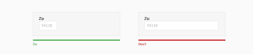
The length of the field must match the length of the response. Use this rule for fields with a predetermined number of characters, such as phone numbers, zip codes, and so on.
Get rid of *:
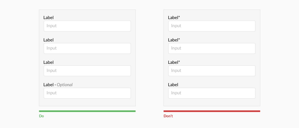
Users don't always understand that the asterisk implies a required input field. It is better to indicate the fields that are not mandatory.
Group information:
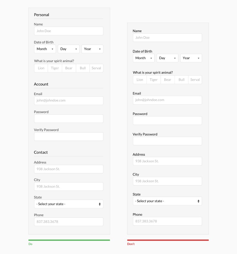
Users perceive information in chunks and long forms can confuse them. By creating logical groups, you can speed up the process of filling out the form.
Why ask again?
Try to get rid of unnecessary fields. Consider other ways to collect data. Always ask yourself how much you need this or that question in the form. Perhaps you can do without it.
Data collection is becoming more and more automated. Perhaps you can use social networks, geolocation, a fingerprint, and so on to obtain data.
Make it easier
Good design is as little design as possible. Nobody wants to fill out long forms, it's too boring. Engage the user in your form. Be cheerful and friendly. If everything is done correctly, your form will definitely be filled out to the end. And remember the little rules above.
Translation - Vadim Kirilenko (facebook)