Company specialists hubspot (one of the most successful marketing software companies) shared interesting test cases Landing page. These market researches will tell you some interesting situations: when landing page flaws are harmful and when they are beneficial! Read more in our free translation:
Imagine a situation where you spent a lot of energy (and budget) to attract targeted traffic, and your visitors, unfortunately, do not take the necessary actions on the landing page.
But why?
Often this is due to the shortcomings of the landing page. They become a barrier to converting a visitor into a customer.
If your text is too long, your button caption is not convincing enough, or your social proof is lacking, you need to start looking for flaws. Read our article if you want to know how Landing with flaws looks like and in what cases they hinder conversions, and in what cases they can be used for the benefit of the business.
When Bad Flaws Help
It can be said that there are good and bad flaws. "Bad flaws"? Aren't all flaws "bad"? Disagree, shortcomings can both help and harm. For example, it is believed that for a landing page, the presence of a long application form is a negative factor.
But at the same time, there are many facts when visitors come to Landing Page (single page site) and find few incentives to perform a targeted action. This condition is often referred to as "psychological resistance".
Do visitors feel a lack of information to make a deal? Do they pay too much to get what you offer?
Despite the opinion that long application forms are ineffective for landing pages, we at HubSpot argue that sometimes such a form is good. Visitors who fill out a long form tend to be more interested and have a better understanding of the product than those who don't.
In other words, conflicting long forms are here a way of elimination. Social media ads are also a variant of this exception. Facebook targeting, for example, may intentionally exclude some users on a demographic basis to avoid wasting money on those who will never buy. The closer we get to the bottom of the sales funnel, the faster we get customers.
Essentially, both long-form applications and Facebook targeted ads aim to reduce inappropriate traffic by using contradictions and exclusions to weed out those who are not the right fit for your company.
For example, Chris Brogan from Owner Media Group goes against conventional internet marketing tools by charging registrants 20$ to attend a webinar.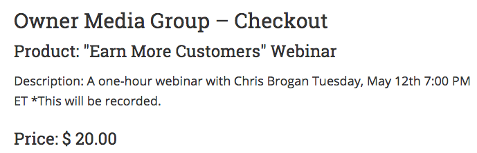
It would be logical to assume that anyone willing to put up $ 20 per webinar would probably be more knowledgeable and interested. Essentially, this approach works to weed out a lot of inappropriate traffic.
Conclusion: what can we take from this approach?
1. You need to determine what on the landing page is really preventing the visitor from passing through the sales funnel;
2. You need to figure out which parts of your landing page are leading to poor lead quality.
How to do it?
Answer: do a good test.
Definition of shortcomings. Two real test cases.
At HubSpot, we believe in the power of tests - even if things go really well initially. Many people consider “we must always be closed” as a sales mantra, but we consider it our motto to “always test”.
There are a lot of things on a landing page that make up for the shortcomings and increase the conversion rate:
- Persuasive Text
- social proof
- Safety
- Links to personal sources
- Images
- Benefits
- Visual triggers (arrows, pointers, etc.)
- Discounts or money back guarantees
1. Split test
Have you ever read an article on the Internet and noticed at the top the time indicator for which it can be read? Maybe it said 5 or 7 minutes, but either way it worked to exceed your expectations before you started reading, right?
We are currently running an experiment to test the effectiveness of including a read time pointer. This experiment asks you to compare a regular image on a landing page with an image that has a time stamp.
To illustrate the experiment, take a look at the image below. As you can see, the first variation contains only the book, while the second one also shows the time in which it can be read: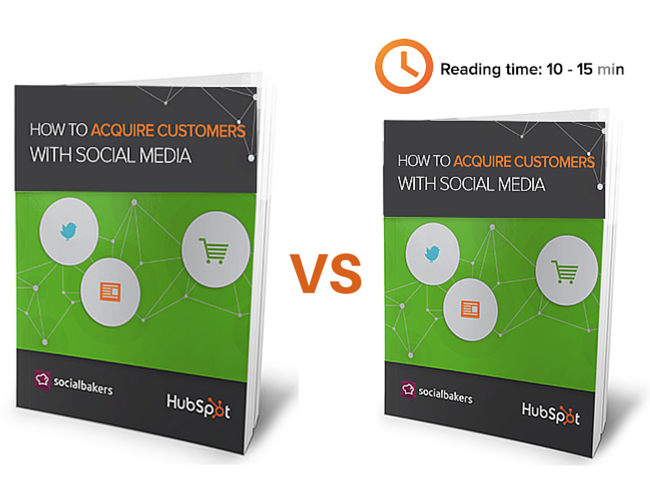
In terms of process, the experiment went like this:
Background
This experiment was inspired by a visitor who downloaded a book. He said that the image on the page roughly indicated how long the book should be. From our point of view, the image of the book served only to offer to download it, i. confusion has occurred.
Problem
Maybe ignorance of the length of the book prevents it from downloading? Realizing that the Internet marketer is often limited in time, and often chooses which parts of the content to read, it is not difficult to understand this problem.
Hypothesis
By "book" is usually meant the length of the paper version. HubSpot books are usually under 25 pages in size. The trouble is, we didn't convey this idea through the Landing Page. We have attracted many quality visitors to the page, however, the lack of information about the length of the content of our books contributes to the loss of interest of visitors, perhaps even forever.
Test
We did an A/B split test on people who visited the landing page of one of our books. One option used a permanent, unchanging cover image, and the other used a cover image with exact reading times.
results
Since then, we have seen an increase of 6% in downloads, which confirmed the hypothesis for all 98%.
conclusions
After the story about the results obtained, an opinion arises about the accuracy of the conclusions. However, to ensure the validity of the results, we plan to replicate the experiment to other books to announce the final winner.
2. Redesign test
Another good example of how to reduce imperfections is a web design story by Yousaf Sekander from RocketMill.
Looking for ways to increase the conversion of one of their clients, Sekander conducted A / B testing comparing the original Landing Page with the optimized one. Check out the image below to see the difference between these two pages: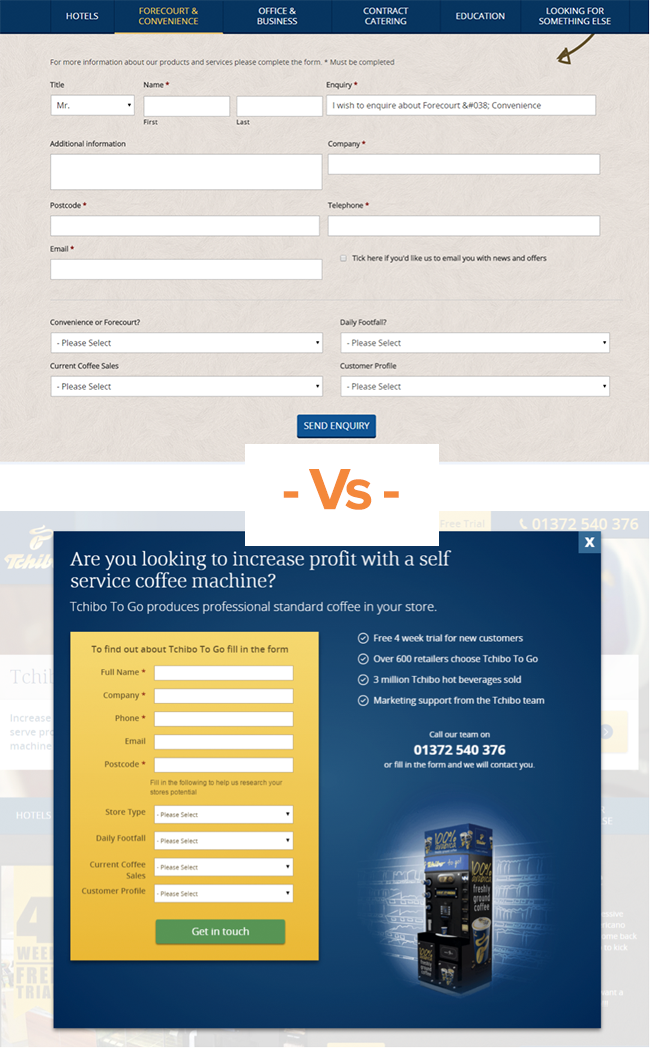
To give you a better idea of how Sekander approached the test, we interviewed him for the purity of the experiment. Here is what he said:
Background
Our client reached out to us to find out why their website visitors weren't moving along their sales funnel. The problem was that the number of applications was very small.
Problem
We analyzed the request form (see above) on the website Tchibo United Kingdom and found several inconsistencies. Although the form was actually quite simple, the web design made it large and complex. In addition to its overwhelming size, there was also no incentive to fill it up. We considered the pinnacle of the problem to be a phone number hidden by scrolling in a complex shape.
Hypothesis
Our manager, Bertram Greenhow, came up with several design ideas to overcome the shortcomings. First, we simplified the form by reducing it to a single column and placing it in contrast with the popup. This was done to reduce distraction and redirect the visitor's focus from messages to the application form. In addition, we added a compelling question headline, a bulleted list of unique offers, a phone number, and a product image.
Test
In order to understand the effect of the web design change, we conducted A / B testing comparing both options.
results
After analyzing the results, we found that the simplified form increased conversions by 200% .
Easy way to get started
If, like us, you have a bunch of hypotheses that you want to test, you should know where to start. We would call the system we use the “Pie” system. It involves creating a simple sheet in Excel, writing down all the ideas in it, and rating it on a 10-point scale according to the criteria: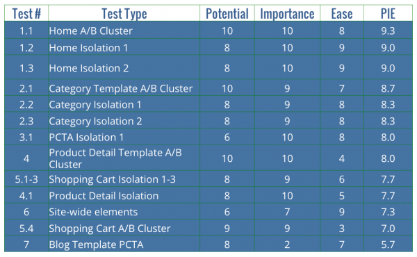
- Potential. Are these page types the worst, annoying?
- Importance. How important are these pages to targeted visitors?
- Simplicity. Is it easy to install?
Calculate the arithmetic mean to get an idea of where to start. After creating data for each of the potential ideas, you understand what is in priority and where to start testing. After all, lead generation isn't the easiest thing to do, but it's important nonetheless. Instead of letting Landing Page flaws affect your conversion rates, feel free to explore different experiments like the one above. And one more thing: you never know until you check.