
Services for online replenishment of telephone bills are only gaining popularity. Nevertheless, the audience in this niche already has tens of thousands of requests per month. But how convenient can the process of replenishing an account on such sites be for the user? You will learn about this and other aspects of Internet marketing from this article using the examples of the sites of the three most popular mobile operators in Ukraine.
Replenishment of the account on the Life website :)
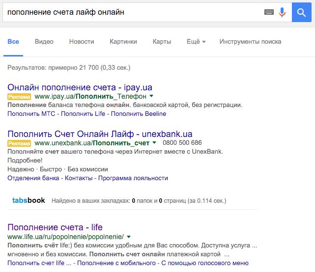
Studying search results
The title of the link to life.ua does not look very attractive. It will be much better if the title is, for example, “Replenish Life:) account without commission”.
The target URL contains twice the /popolnenie section. This makes the address itself illogical. And this element in this form loses any marketing value and all attractiveness. The URL must match the content of the page.
As you can see, there are third-party top-up services in the ad results. And although life is the first in organic search results, from 10% to 30% users can still leave through contextual advertising.
The absence of Life:) contextual advertising for such branded queries is a big omission. The main loss is the departure of some users to third-party sites. Also, if there is advertising, it will be possible to collect a lot of useful data about this audience, which cannot be obtained with only organic (free) search.
The Google search engine makes money on search only from contextual advertising, which is why Google provides much more advertising opportunities and marketing data for those who advertise through context.
In addition, through contextual advertising, you can launch complex advertising strategies involving conventional remarketing, search remarketing, dynamic remarketing, video remarketing. At the same time, the audience can be segmented by amounts, dates of the last replenishment and replenishment frequency, showing ads to those who, according to their replenishment frequency, most likely already need it. And if the ad also contains a call to replenish its usual amount (which is quite realistic when setting up analytics), then the probability of a click on this banner will be very high with the same high probability of conversion after a click.
In addition to replenishment, the operator can use this audience to promote its main services and new tariff plans or to notify about promotions or discounts.
Among users who often replenish their number for large amounts, there will be a high proportion of loyal and solvent customers, with whom marketers can already work in a variety of ways.
Conclusion: contextual advertising is required for Life:) company.
We pass from the search to the site life.ua
http://www.life.ua/ru/popolnenie/popolnenie/
- Writing all headings in capital letters is considered very bad manners and a very inconvenient solution for the user himself.
Compare for yourself which text is easier and faster to read:
-
REFUND YOUR ACCOUNT INSTANTLY AND WITHOUT COMMISSION
-
Top up your account instantly and without commission
Despite the fact that in the first case the font size is smaller, but it takes up more space and is read worse.
Capital letters are justified only in rare cases, but it is categorically impossible to abuse them as on the life.ua website.
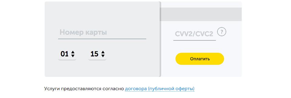
- The body text in data entry fields is so small that it forces anyone with imperfect eyesight to peer at the text or increase the font size in the browser. That is, with such a small font, you force some of your visitors to make additional efforts, which is bad.
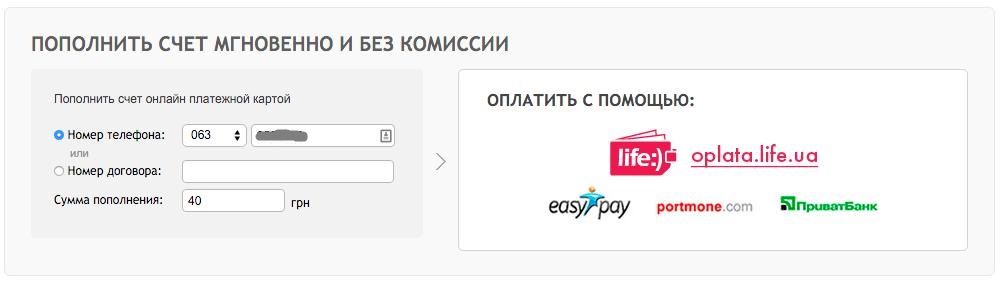
Users of the site should achieve their goal without any effort. That is why, according to many usability studies (meaning current research in 2015), the font on the site should be at least 15-16px. And in the data entry field - even more than 16px.
The fields “Phone Number” and “Contract Number” are mutually exclusive. In this case, it is recommended to make an inactive field a dark background without the possibility to fill in data in it. This simplifies the overall perception of all fields in which data must be entered, does not distract the user's attention and reduces the likelihood of error.
- The replenishment amount must be entered in numbers. But you can place buttons with the most popular amounts, which will simplify data entry for 80% users.
- The next block “Pay with” is also ambiguous. This block should be clear even to the most inexperienced site user without any intellectual effort. In the current version, you need to guess that the images are clickable. An inexperienced user will not understand this.
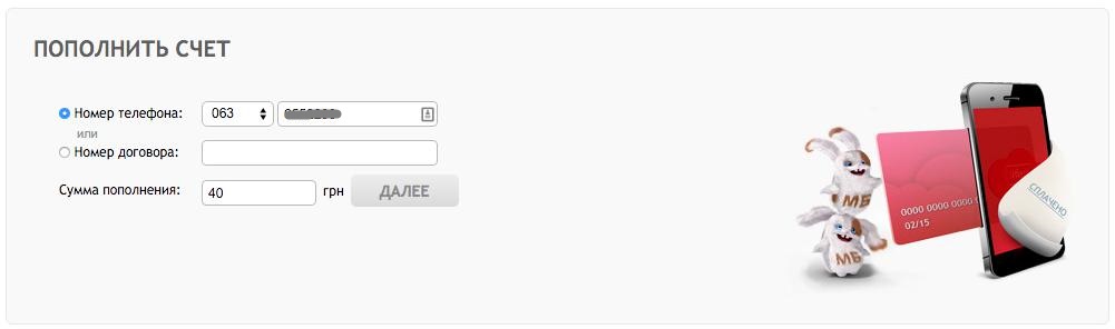
It would be better if each of the blocks was signed as "Step 1" and "Step 2". In this case, it would be clear that after entering the phone, you should choose a payment method. But the payment methods are placed in order one below the other with a large text name and a logo located to the right of the name. The choice of payment method can be made by a selector element of type “radio”. If it is necessary to promote the popularization of the oplata.life.ua method, then this item should be selected by default.
- It would be more appropriate to name the “How to make a payment” block “Other methods of replenishing an account”, since with the current name there is an expectation that the information in this block relates to the current method of replenishment (in the sense that it explains what needs to be done on the site to make a payment) , but in fact this information does not apply to this method of replenishment.

- When switching to the payment method oplata.life.ua, you need to click “Next” again to open the next window with fields for entering payment card data. This is a useless action that the visitor is forced to perform. You should unequivocally get rid of this action and immediately show the fields for entering payment card data when switching.
- Fields for entering payment card data and the font in these fields is critically small. Both the font and the margins themselves need to be increased by a few pixels.
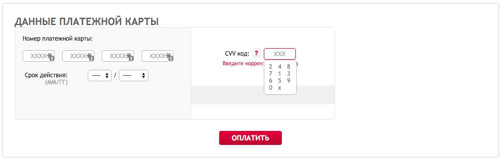
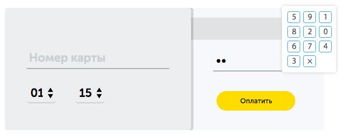
- The drop-down menu for entering CVV is also very small and must be enlarged.
- The site is not responsive and will not display correctly on mobile devices. This will lead to the fact that smartphone owners, when visiting the site, will experience great difficulties in trying to achieve their goal and leave the site without completing the desired action.
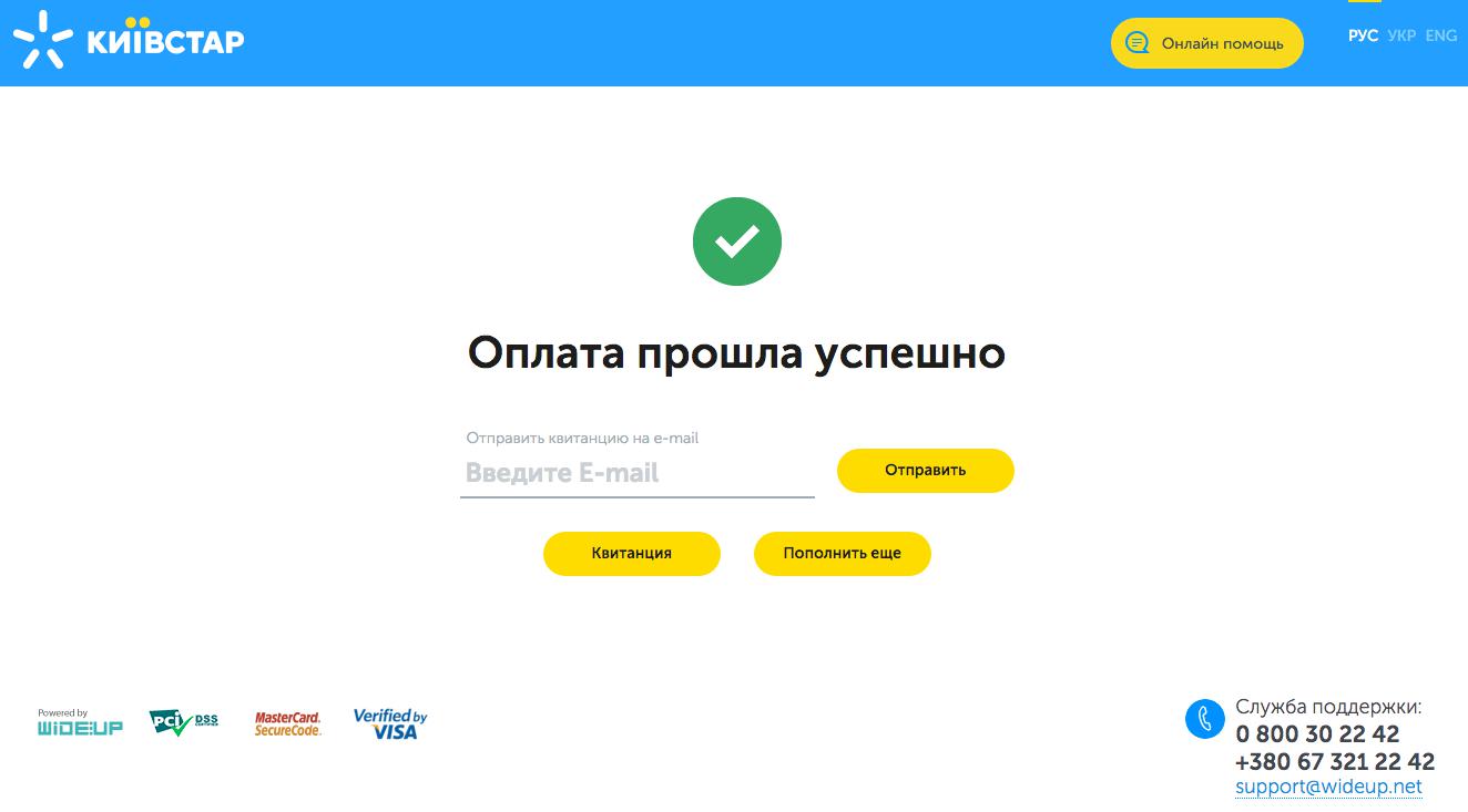
- After replenishment, you should not only notify the user about the successful operation, but also thank you for using the service. In addition, at this stage, you can try to achieve some of the additional goals:
- invite the visitor to bookmark the site so that it will be easier to find your service next time;
- recommend to subscribe/join your communities in social networks;
- offer to send a notification to the user's mail or phone about the need for the next replenishment of the account after any specified period of time (by default, you should specify 30 days or offer a choice of the most popular number of days);
- offer to notify the user with a pop-up window in the browser when the account balance drops below UAH 5 (this option can be implemented only in the Chrome browser and only for authorized users).
And of course, all this text should be in a much larger font than it is now. What font size is required is stated in paragraph 2.

Brief conclusions: the site is outdated, inconvenient, the possibilities of Internet marketing are not seriously involved in any way. There is no adaptive layout, it will be very difficult and problematic to replenish an account from a mobile device.
Replenishment of the account on the Kyivstar website
Let's study the search results
Similar to the previous example, Kyivstar should launch contextual advertising for its brand and use the contextual advertising tool to the maximum as part of its online promotion strategy.
The landing page URL is also not optimized and does not carry any marketing load, but it could with proper optimization.
For some reason, the title of the snippet contains a lot of vertical lines and an indication of the Kyiv region and “Mr. Kyiv” in such a rare spelling with the abbreviated letter “g”, and even with a dot. Such optimization is hardly justified, since the user expects first of all to find out whether it is possible to replenish the account via the link, how and how much it will cost.
Therefore, first of all, you should try to place the phrases “by payment card” and “no commission” or “0% commission” in the title (1 character less and numbers with the sign % attract attention better than the preposition “without”).
The description of the snippet is written without spaces. Because of this, it is very poorly readable and, unfortunately, like the URL, does not carry any marketing value for the user.
We pass from the search to the site kyivstar.ua
http://www.kyivstar.ua/ru/od-631/mm/recharge/recharge/
When following the link, we see a page with a large number of sections and with a large yellow circle that attracts all the attention with the inscription “Top up online without commission”. The mistake in the word “commissions” is, of course, unpleasant and unacceptable for such a brand, but not every quick glance of the user will pay attention to it. At first I thought that this was a typo, but no - in two places this is already a mistake, not a typo.
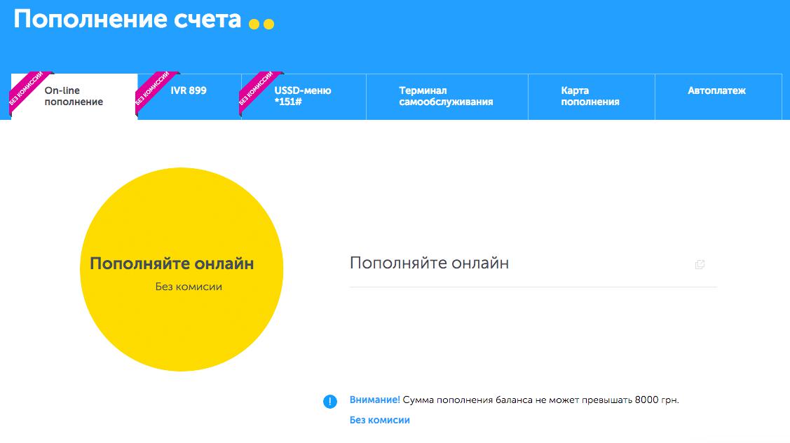
Only on this page it is not entirely clear what should be done next. There are no buttons or data entry fields. If you move the mouse over those elements where you intuitively expect to see data entry fields, you can immediately notice that there are no links on the circle, but on the phrase “Top up online”, located to the right of the yellow circle, there is an unknown hyperlink.
It remains only to regret the users of tablet devices with touch screens - they will not be able to run the page with the mouse cursor and find all the links. I suspect that they will unsuccessfully try to click on the big yellow circle, and after a few unsuccessful clicks, perhaps most will close this site and go to another one.
What happens after clicking on the link itself - no one knows. But there are not many options - either leave to look for the truth on other sections and pages, or click on this link. We press.
After clicking, we go to the page of a third-party site with the address https://pay.wideup.net/e-comm/kyivstar/ru/
Most likely, this is some kind of payment system through which Kyivstar users can top up phone bills from their payment or credit cards.
There will be much fewer failures if the Kyivstar website prompts the user to enter their phone number or personal account. Next to the phone input field, place a large “Next” button. And by pressing the “Next” button, the user goes to the link that is now, only after the transition the entered data is saved and the user will only have to enter the replenishment amount and payment details.
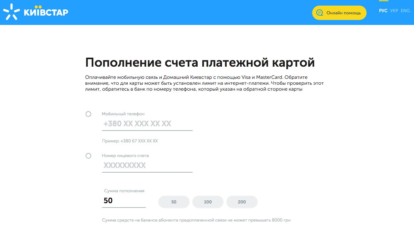
The page is well designed. There are no particularly superfluous elements, unlike Life, here. All attention is focused on the main goal for which the user went to this page - replenishment. For convenience, there are even special buttons for selecting the amount of replenishment, and by default, the amount of 50 UAH has already been entered (as I understand it, this is the amount of the most frequent replenishment).
- The main disadvantage is that there is a lot of free and unused space on the first screen. Despite the fact that the fields for entering the details of the payment card itself and the “Pay” button are placed on the second screen.
Assessing how the space of the first screen is used, we can say with confidence that the fields for entering a payment card and the “Pay” button could easily be placed on the first screen, next to the current fields for entering the Phone, Account and Replenishment Amount, without restricting the user in the convenience of working with the last three fields.
Always and on all sites, developers (or rather, interface designers) should try to place all strategically important elements on the first screen. The user should not be forced to scroll to access the information on the following screens if this can be easily avoided.
- On the first screen, the situation with the mutually exclusive data fields “Mobile phone” and “Personal account number” is similar to the situation with the same fields on the life.ua website. Unused sections should either be shaded, or vice versa - additionally highlight and underline only the selected fields.

- All text is grayed out, with the heading and subheading on the page written in very nice high contrast black. It seems that all the gray text is of secondary importance in the background of the title and subtitle, and this gray text should not be read at all.
All important text should be highlighted in black. Gray can be left inactive fields on the first screen.
- A pop-up window for selecting digits of the CVV code - this greatly improves security and reduces the risk of interception of filled data, even if information is leaked through a virus on the user's computer. Even better is that all the numbers are reversed as soon as you click the cross when the entered data is wrong. That is, it is very difficult to intercept this data.
The solution is excellent and should be used by everyone who has to fill in the details of their payment cards on the site. With such an implementation, cybercriminals have very few chances.
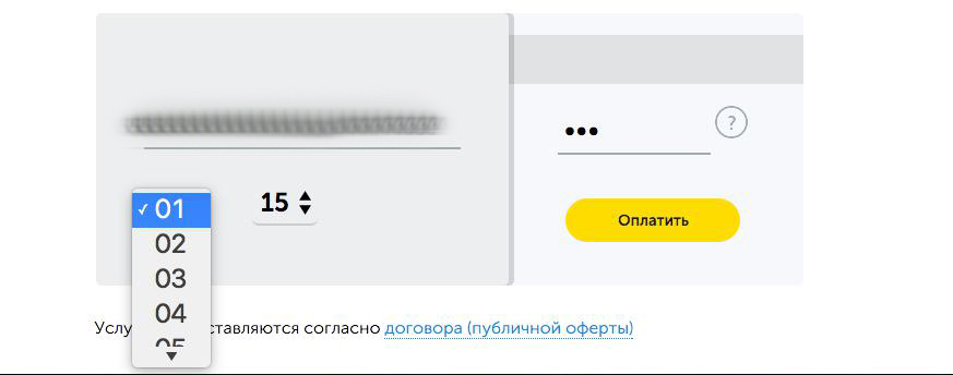
- When filling in the payment card data, the drop-down menu for the month and year of the card is implemented with convenient large numbers, but not the most convenient view. More precisely, this menu falls out in a not the most convenient way. If the screen is limited to the bottom, you should activate this menu to the top of the screen, not to the bottom.
But on the other hand, if this element were located on the first screen and there was still a lot of space under the input field by default on most of the most popular resolutions, then this inconvenient situation could be avoided.
And even if this situation is not very critical, nevertheless, everything on the site should be implemented as user-friendly as possible. And if this option or method exists, but is not implemented, this is a development error.
- On the successful payment page, the situation is similar to the previous service. This page is also not used for additional purposes. There is also a lot of unused empty space on the screen, which can be used just to achieve additional tasks. And the user does not see any gratitude for the payment. Only green tick.
The thank you page is located at https://pay.wideup.net/e-comm/kyivstar/ru/
Since this service is not the primary source from which we switched, we can assume that the data in the analytics of the first source (that is, the main Kyivstar website) breaks off at the moment the user clicks on this link.
For an Internet marketer working with the Kyivstar website, this is very bad, because in the analytics of the kyivstar.ua website on the page http://www.kyivstar.ua/ru/od-631/mm/recharge/recharge/all data on paid invoices will be missing. It will not be possible to determine which source or which visitor how much, how often and for what amount replenishes the account.
Brief conclusions: the site is modern, convenient, but there are mistakes in usability and in the design of the page interface. It is very inconvenient that there is a transition to another page of a third-party site, while the visitor was not notified about this transition in any way. Moreover, the link with the transition itself is poorly identified. Well, after payment, there is no transition to the Kyivstar website, which means that the data is cut off and is unlikely to be transferred to analytics, which is bad for researching results and achieving Internet marketing.
Replenishment of the account on the MTS website
Let's study the search results
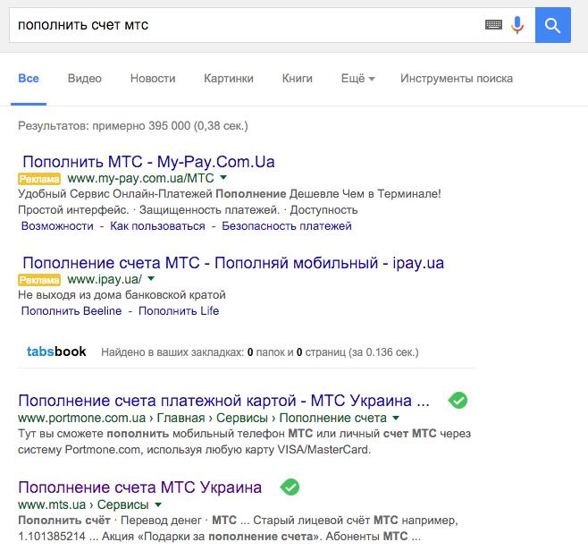
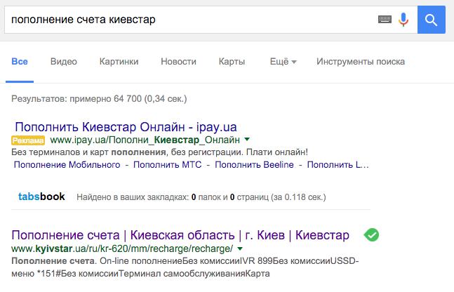
MTS is not even in first place in organic search results. Such a large brand, but gives its traffic to other services. And of course, contextual advertising is also at the mercy of other companies.
The title and description of the SERP snippet does not say a word about whether there will be a commission here or not. I consider this an omission, since all other services focus on this in their marketing.
Moreover, the description in the snippet is a set of phrases taken out of context. This indicates poor SEO optimization of the meta tags of the site, namely this page.
We pass from the search to the site mts.ua
http://www.mts.ua/ru/online-services/payment
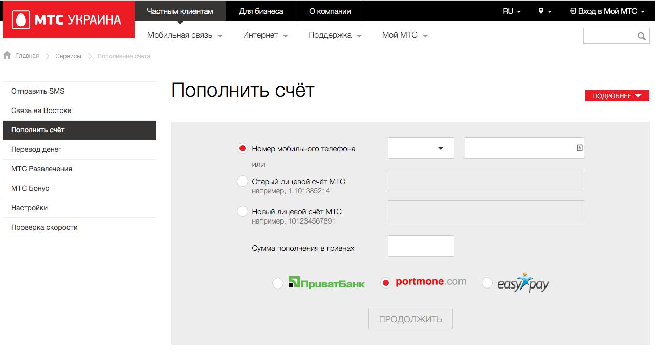
When going to the MTS website, we see a situation very similar to the Life :) website - there are a lot of additional links and sections where the user can go without reaching the main goal of visiting the site. In this sense, the Kyivstar site has the best implementation and does not distract the visitor with unnecessary sections (at least, there are at least these links on their site).
But this is not too critical.
- But what is critical is that it is absolutely not clear to the user how much it will cost to replenish a telephone account through the MTS website. And you can find out this information only by clicking the “Details” button located in the upper right corner (I don’t think that many people notice it even despite the red color of this button).
The form itself is very convenient and intuitive. For convenience, they even made it possible to quickly select the first digits of their number (the so-called operator code).
- There are no buttons with numbers for the most popular replenishment amounts for quick selection.
- The “Continue” button is grayed out at first, and only after filling in all the important fields does it become black and can be clicked. I don't know how convenient it is. This solution has both pros and cons.
I recommend A / B testing this button in two versions - immediately with an active color and in the current implementation, in order to determine whether the website visitors are initially repelled by the fact that the “Continue” button does not work without filled data.
The black color of the button is not the best solution. The button should be the brightest and most eye-catching element on the page. And it is better to make it red, not black or gray.
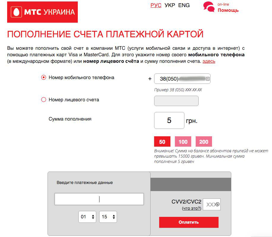
By clicking on the “Continue” button, the user goes to the Privatbank page (with the appropriate choice of payment method), developed in the style of MTS. The data with the phone number and payment amount was transferred to this page and pulled into the appropriate fields. Only here the fields for entering payment data should be placed a little higher, since on my average laptop screen they are already a millimeter from the bottom of the screen, and on an even narrower screen they will be completely outside the first screen, and this will already force visitor to unnecessary actions on the page.
Enter payment details and confirm. And we see a window with a smiley face and a notification that the payment was successful.
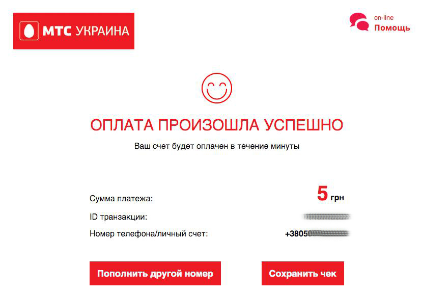
And here the user does not see any gratitude, but at least the smiley pleased the eye. There is also no transition to the main site, which means that data about the transaction itself is unlikely to be transferred to analytics. The thank you page itself does not allow you to achieve any additional goals, like the two previous services in question.
Brief conclusion: a fairly convenient form of payment, it is difficult to find information that payment is commission-free, convenient large elements in the data entry fields, inactive fields are hidden by gray fill, which significantly increases attention to required fields. In general, replenishing is quite convenient.
This article has a completely non-commercial purpose. Moreover, these services are not competitors to each other, since they offer the function of replenishing an account only for customers of their mobile network.
So far, it is surprising how far from ideal the sites of the three giants of the mobile operator market are. And if the sites of Kyivstar and MTS meet modern requirements at least a little, then the site of the Life:) operator is not only obsolete, but also very inconvenient in its use, especially inconvenient for people with poor eyesight.
By the way, why are mobile operators focused on replenishing only their phones? Why not offer on your website to immediately replenish the phone account of another mobile operator? Payment systems, after all, assume all this. Indeed, in Ukraine there are quite a few people who are customers of several mobile operators at once.
Moreover, the chief marketer of Kyivstar, Life:) or MTS is simply obliged to offer to develop such a service, perhaps even under a third-party brand. But you can, as an option, buy out one of the large already popular services. After all, one of the strategic marketing tasks of mobile operators is not so much to increase the number of customers through new users who buy their first card (after all, the market in Ukraine has long been overheated and there are very few such users), but by poaching customers from other mobile operators. Moreover, those users who talk a lot, that is, spend a lot, which means they often replenish their account.
This strategic task can be easily solved by offering users of another mobile operator, who often replenish their mobile account, special offers and special tariffs to lure them into the ranks of their regular customers.
With customized analytics and contextual advertising, this is done without much difficulty, using flexible remarketing strategies in Adwords, Direct, Facebook and Vkontakte.
The author of the article is the head Star Marketing Sidnev Vlad